
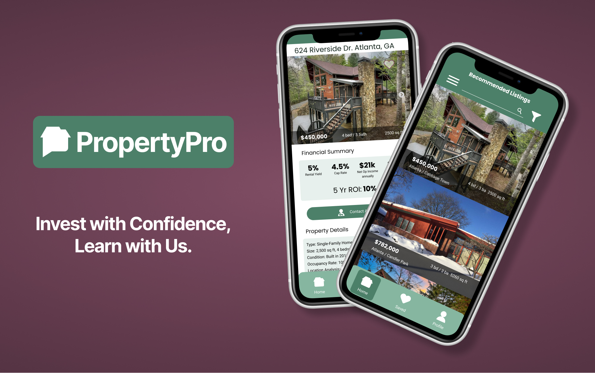
PropertyPro is a web-based realty app aimed specifically at property investors. This exercise was focused on creating a UI, so it started from a project brief with objectives, a persona, and design criteria already in place.
My Role
UX/UI Designer
Duration
8 weeks
Tools
Figma
Photoshop
- Responsive Layouts using Grids
- UI Elements for consistent look & feel
- Info Hierarchy using typography
- UI Patterns, Color Scheme and Imagery with Style Guide
- Custom icon set
- Wireframes for Mobile, Tablet & Desktop
Project Summary
Background
New investors need guidance on how to begin to ensure financial security
Requirements
Create sense of professional guidance and encourage learning
Objective
A responsive web app that provides property buyers with information on properties of interest
User Flows
In an effort to understand what screens I needed to design, I used the following user flows to ensure there were no gaps in my design.
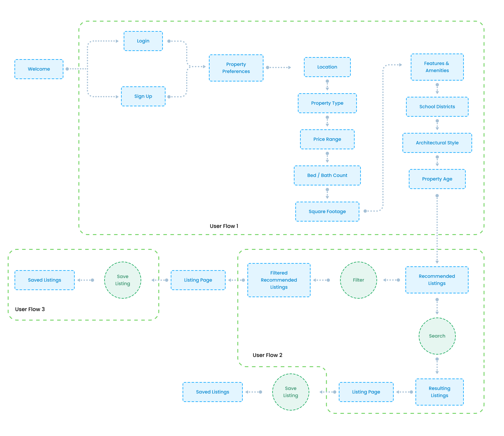
User Flow 1: As a user, I want to create a profile containing all my property criteria, so that I am recommended results most relevant to me.
User Flow 2: As a user, I want to be able to search and filter properties, so that I can find good matches based on my needs.
User Flow 3: As a user, I want to be able to save or mark properties I am interested in, so that I can easily revisit them.
Wireframes
With my user flows created, I could proceed with lo-fi wireframes to get an idea of what the app might look like while meeting the needs of my users.


With the ideas sketched out I moved forward with making mid-fi wireframes in Figma.


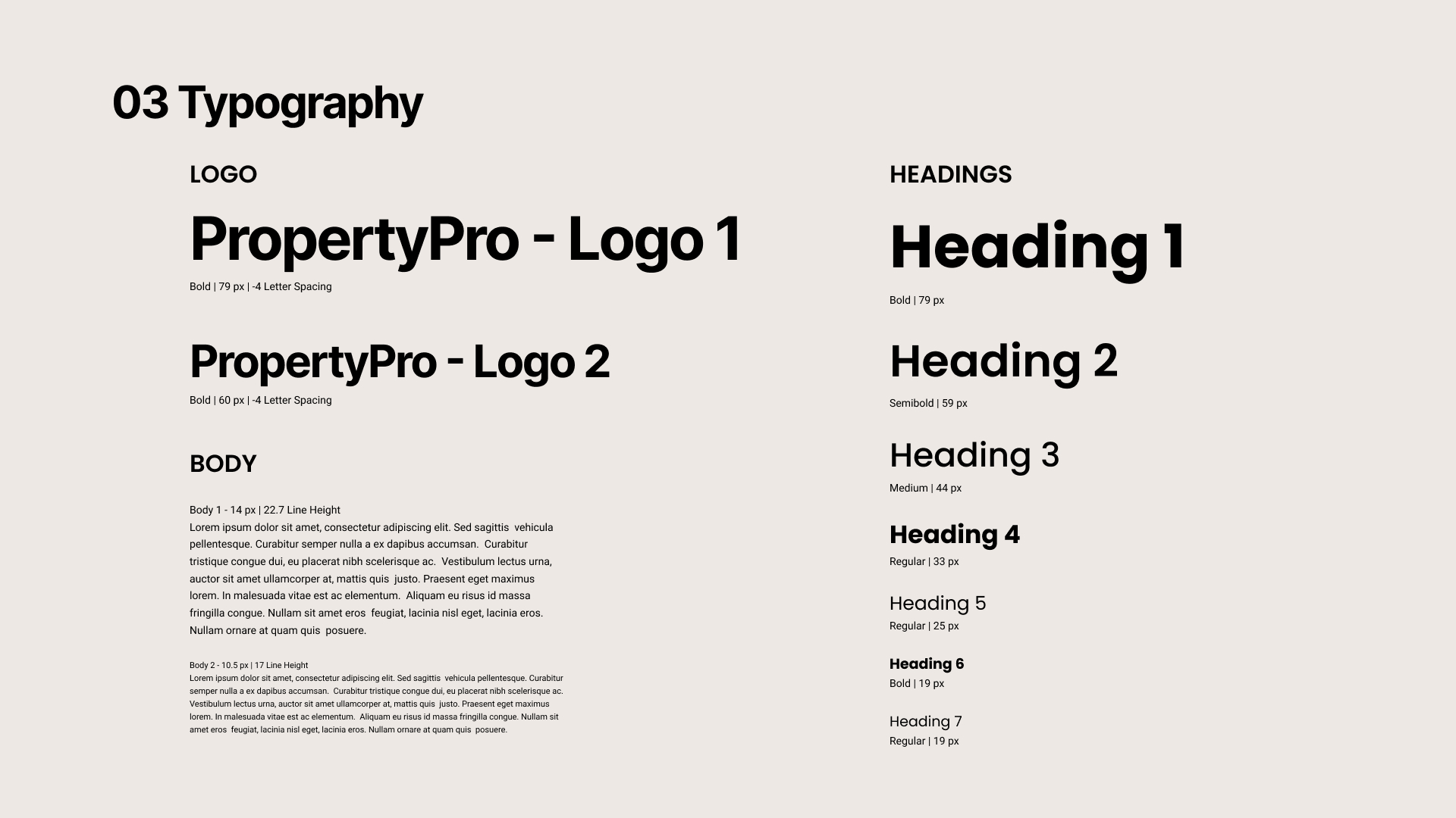
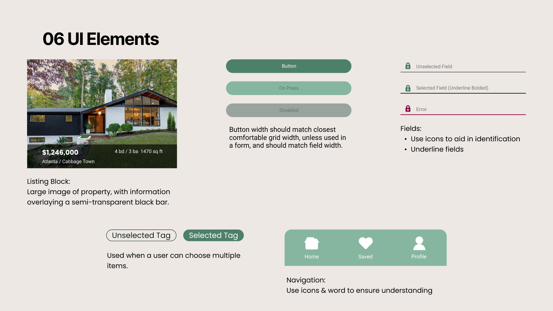
Style Guide
It was time to put some pizazz into these wireframes, so I put together a Style Guide to ensure consistency across each screen.
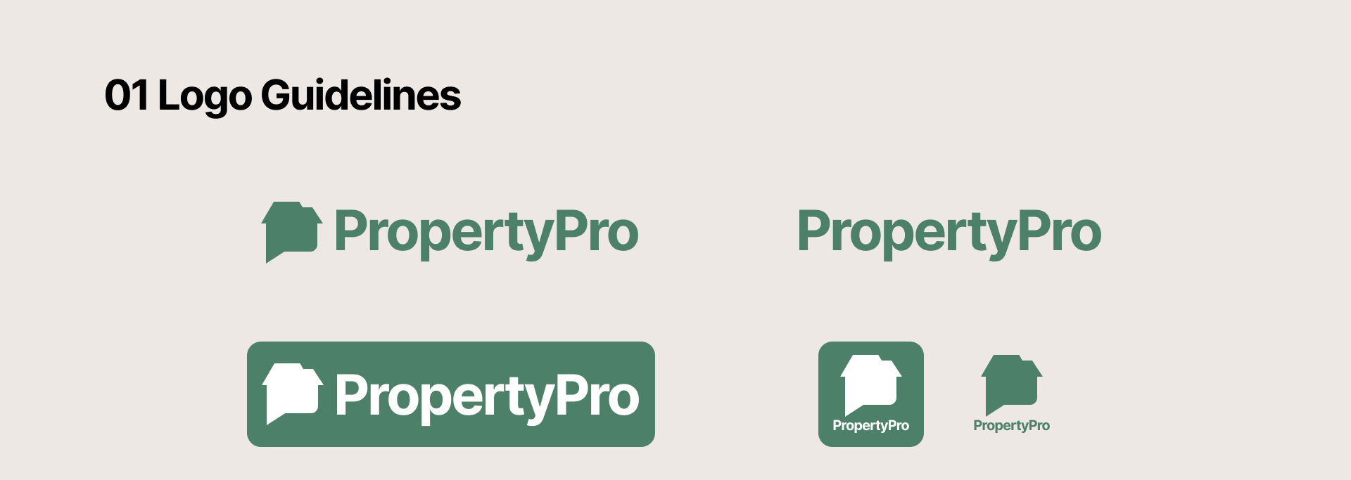
The logo icon is a variation on the common “home” icon, but with a multi-leveled roof. The bottom half is reminiscent of a chat icon, which gives it a dual purpose of invoking a conversation with experts, learning how to invest, and suggesting a “P”, the first letter of the app name.
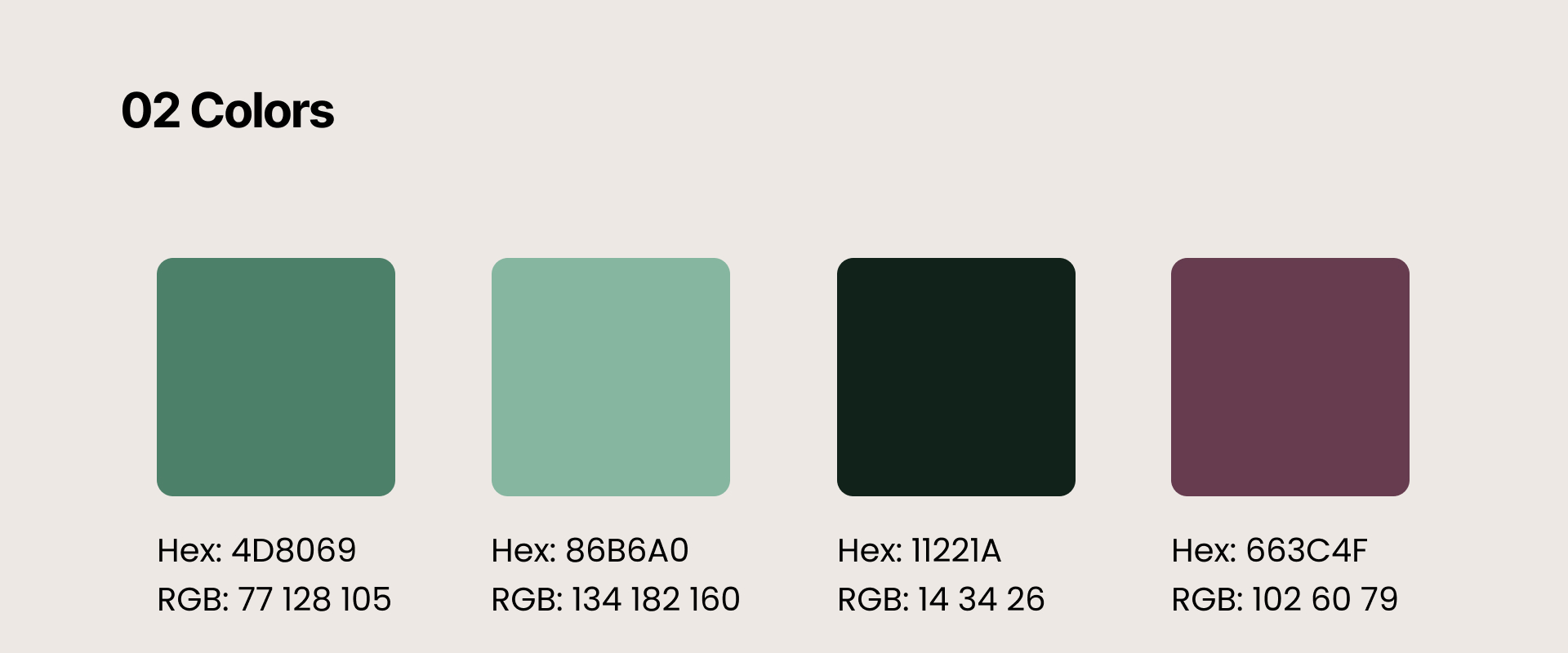
I chose to use green as the basis for my color scheme, as users associate it with growth, money, and success, all things our users are looking for in the service.
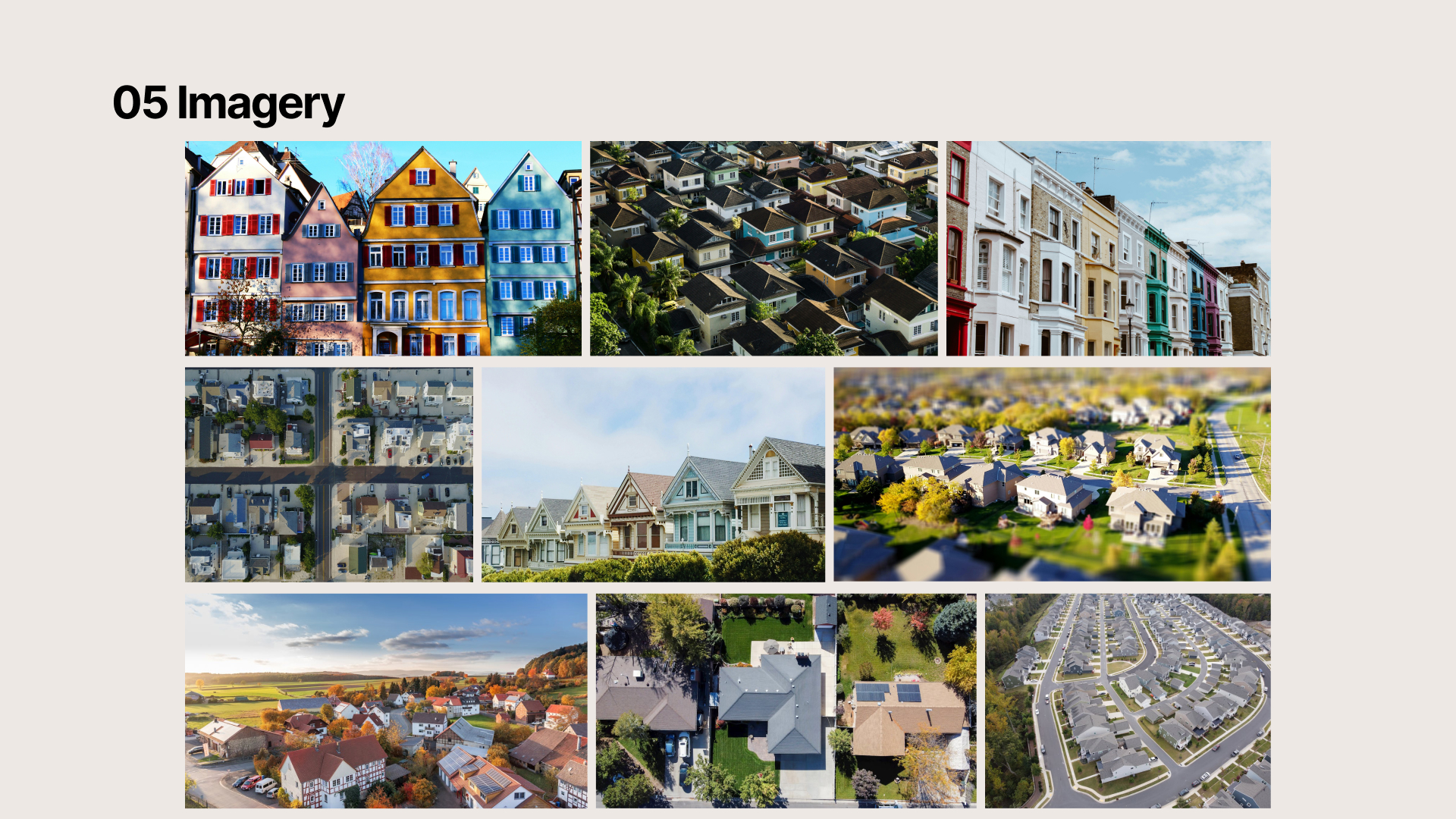
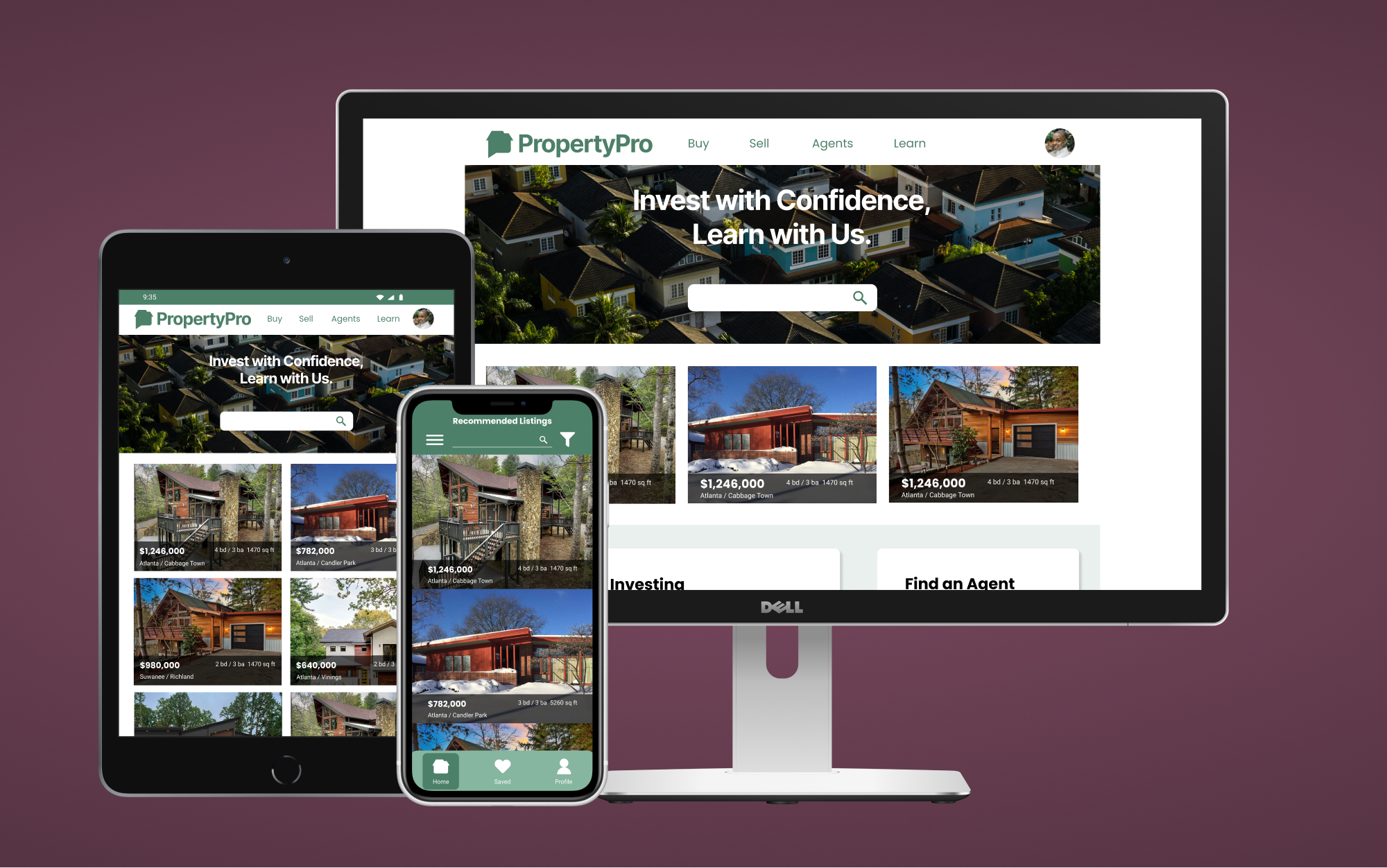
Instead of individual houses, all promotional imagery contains multiple homes because my users aren’t looking to live in the properties and don’t need a personal connection to them. Instead, they will be investing in part of a larger community, so using images of vibrant, successful neighborhoods gives a better sense of security for an investor.
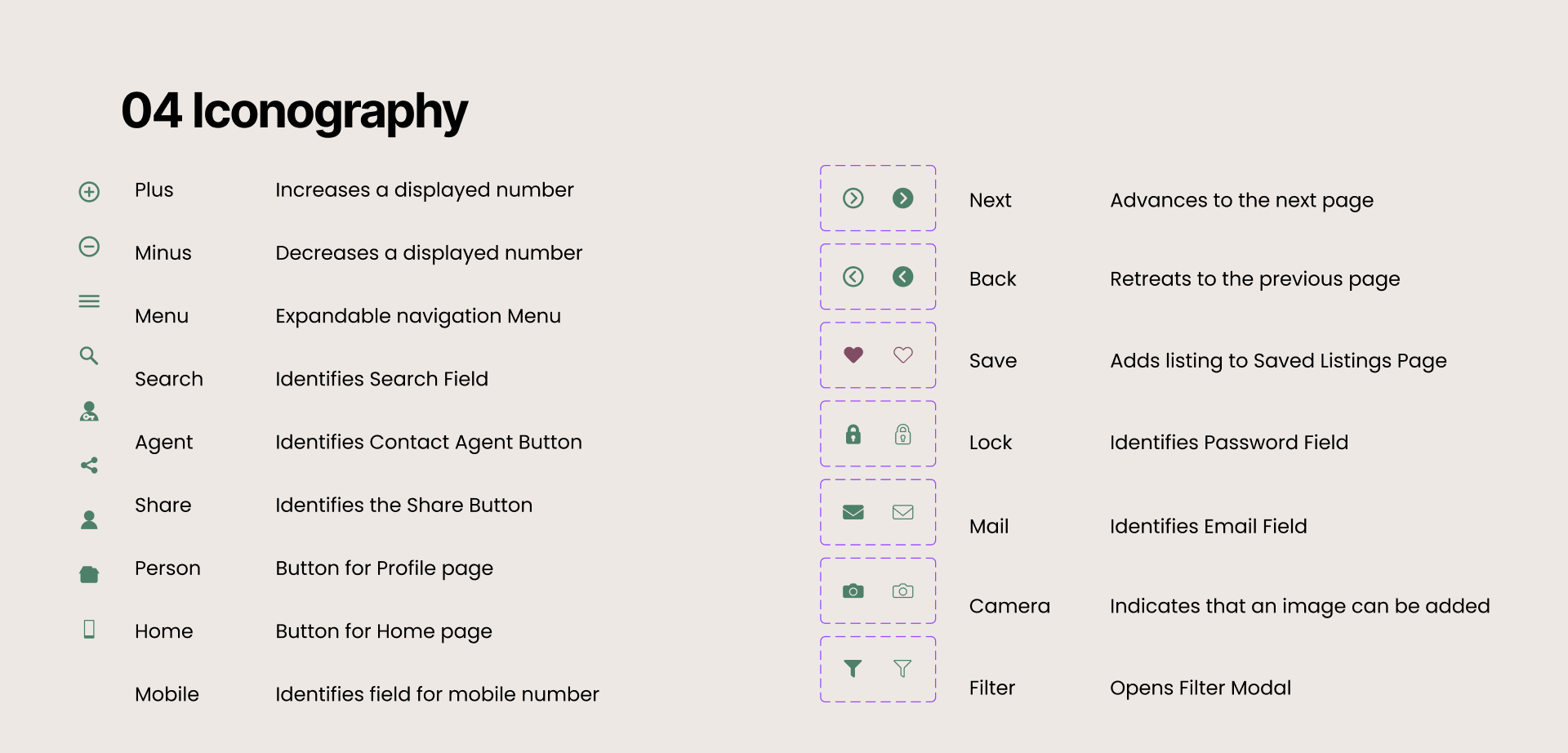
I designed the iconography to be minimal but soft, with rounded edges. This gives a sense of professionalism, without coming across as elitist. I want users to feel like they are welcome, but also that I take the work seriously.
Animation
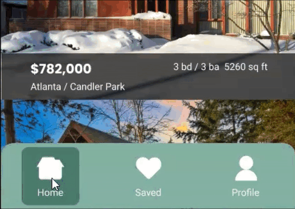
To add a bit of life to the app and help users know exactly where they are in the app, I added a simple animation to the navigation bar.
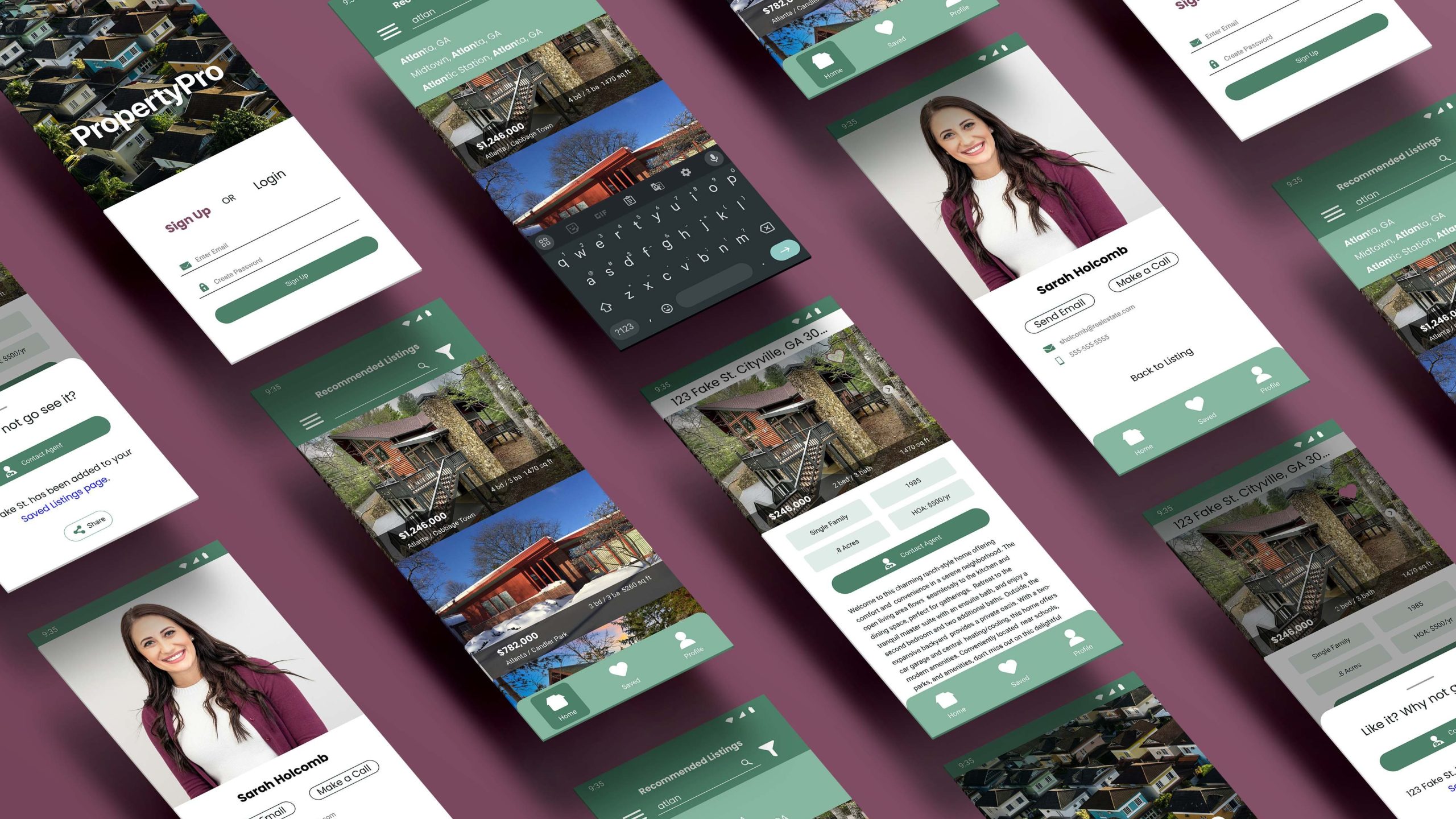
Final UI
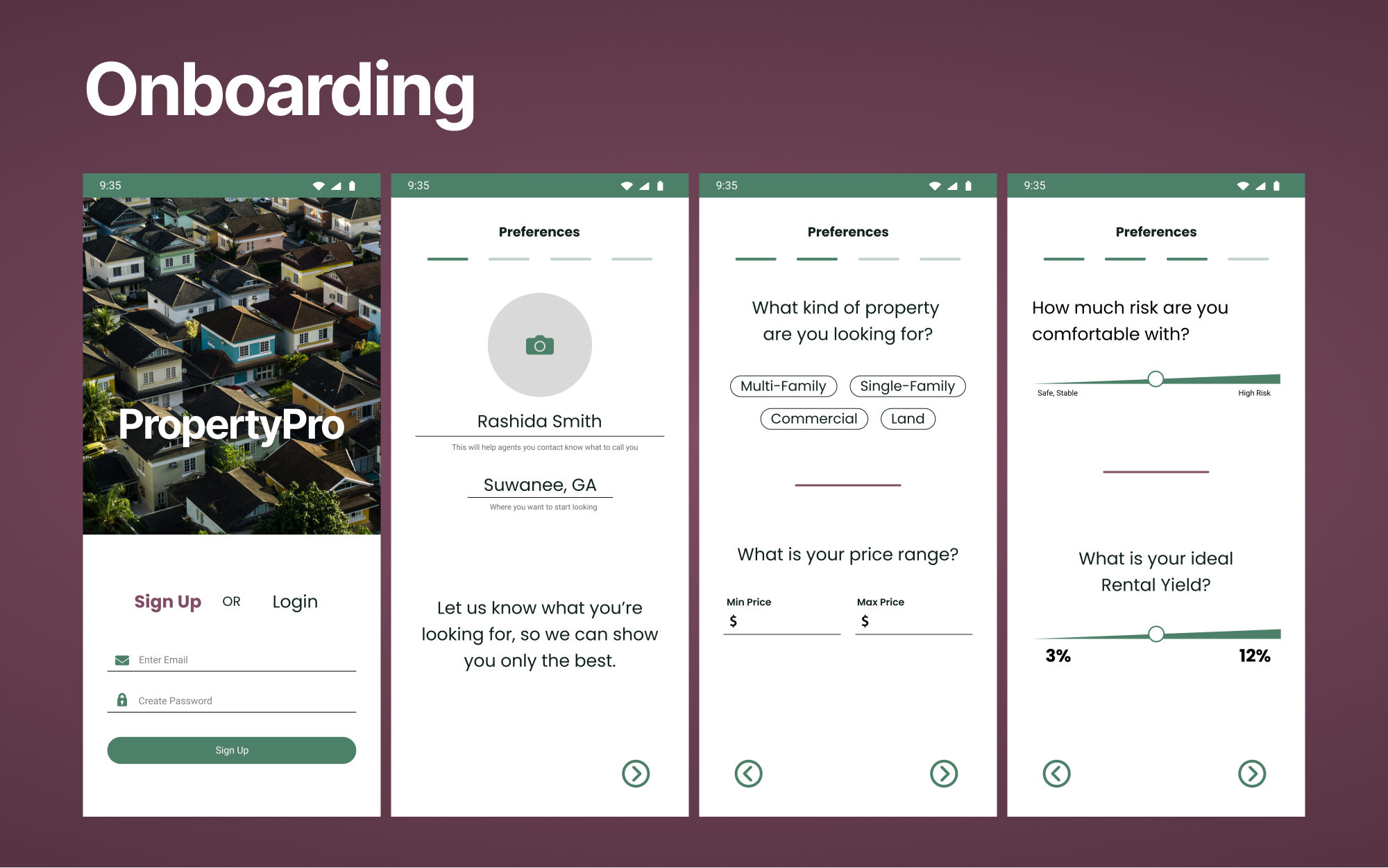
With PropertyPro designed for investors, and not homeowners, the onboarding process focuses on things like risk aversion and financial goals, rather then personal amenities like number of bathrooms.
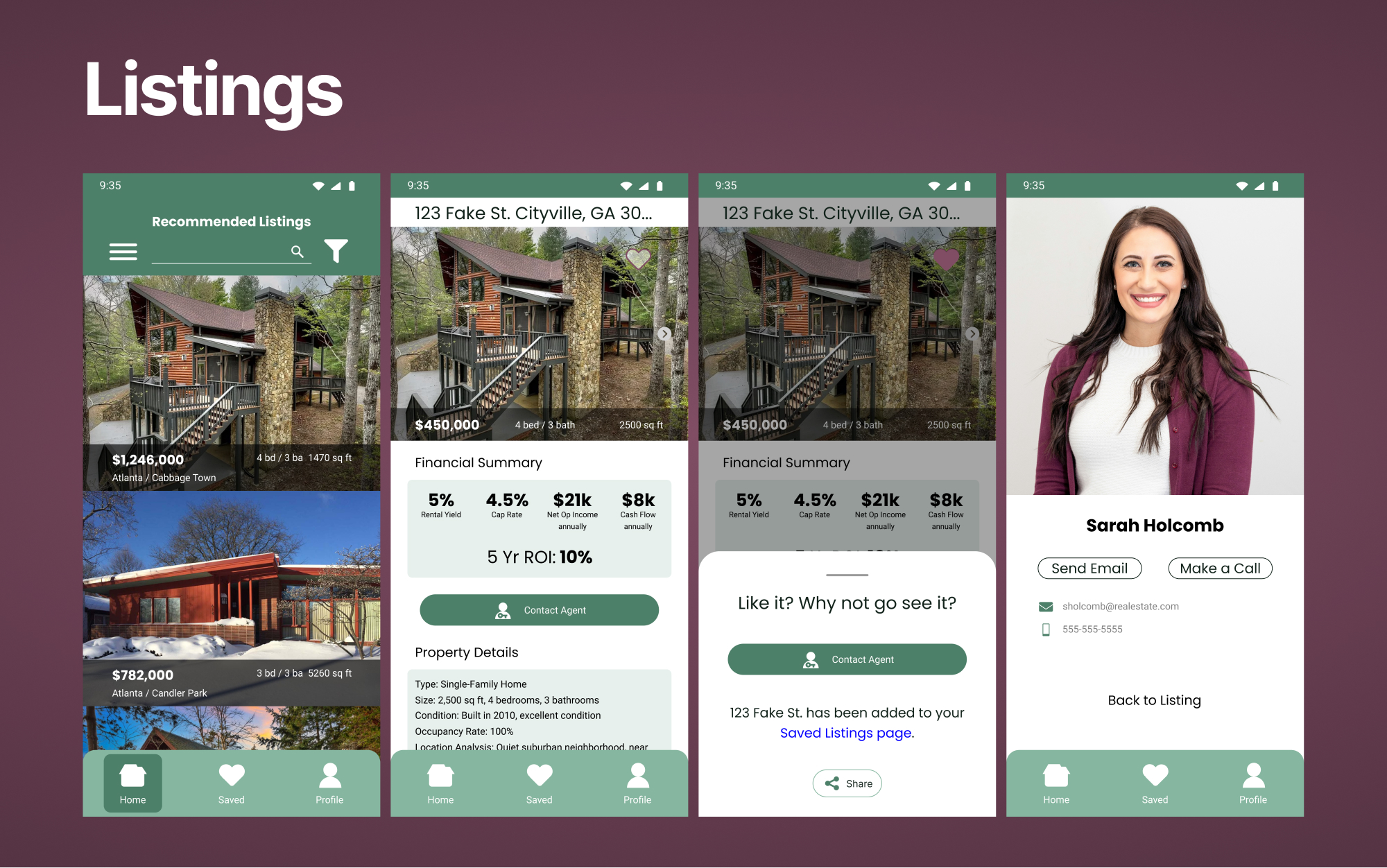
Listings within PropertyPro put the financial data forefront so users can quickly assess if the property is what they’re looking for.
Reflection
I learned a lot doing this exercise. I’ve always been able to tell what is good design and what is bad, but I’ve never been able to articulate why. By learning the principles behind UI Design I can now understand what can be done to make a good design better, and how to build a sound UI from the ground up.
If I had more time to work on this project, I would add in more educational / informational content to fulfill the goal of making new investors more comfortable. I would also flesh out the desktop breakpoint.

Thanks for reading my UI design exercise for PropertyPro. I’d love to hear what you think, so feel free to send me email.